Projects
Overview
In today's hectic world, choosing a restaurant can be overwhelming. Meal Dealer simplifies the process, offering diverse dining options, personalized recommendations, and easy account integration in one user-friendly app. Eliminate the restaurant search stress and enjoy a more connected and convenient dining experience with Meal Dealer.
Role
Sole UX/UI Designer
Duration
2 months
Project
Problem statement
The current restaurant discovery and booking landscape are marked by an abundance of options and information, leading to a user experience where individuals often feel overwhelmed and struggle to make confident decisions. The multitude of standalone apps, such as Zomato and OpenTable, contributes to information fragmentation, making it challenging for users to streamline their search and booking process efficiently.
User pain points
Information Overload: Users are bombarded with a vast amount of information from various restaurant apps, making it difficult to narrow down choices.
Fragmented User Experience: Managing multiple accounts on different platforms adds complexity to the user journey, leading to inefficiencies and potential frustration.
Decision Paralysis: The sheer number of options can lead to decision paralysis, hindering users from confidently selecting and booking a restaurant.
Proposed solution
To address these challenges, I've designed an app that consolidates information from various restaurant apps, such as Zomato and OpenTable, into a unified platform. This app will allow users to seamlessly connect their accounts from different restaurant apps, providing a centralized hub for searching, discovering, and booking restaurants.
User survey
After the issue was identified, a series of questions were asked, anonymously, using Google Forms, to determine the route that the user takes while looking for a restaurant. The form was answered by 30 people and consists of just five questions, all of them multiple-choice.
Q1
What is the first thought that comes to you when you think about going out to dinner?
Asking friends for opinion
13.3%
Download an app dedicated for restaurants
50%
Google searching
16.7%
Search on maps (iOS) or Google Maps
20%
Q2
How many services (applications, Google, Maps/Google Maps) do you use at the same time when searching for a restaurant?
1
3.3%
2
70%
3
26.7%
More than 3
0%
Q3
Do you have to switch between apps to tell a friend that you found a restaurant?
Yes
90%
No
10%
Findings
Downloading apps has become crucial for restaurant discovery. With numerous options available, people often find themselves downloading multiple applications to accomplish a simple task. The rising trend of app usage spans across various services, and the food industry has notably played a significant role. However, the abundance of choices provided by different services can lead to choice overload, causing users to experience mental exhaustion and dissatisfaction.
A persona was then created, representing a broader audience, aiming to understand their unique needs. This persona isn't just a theoretical figure, it's a snapshot of real-life users, capturing their distinct traits and qualities. Picture it as a friendly guide that helps us navigate the diverse landscape of our target demographic, ensuring that my app aligns with their experiences.
Meet Ben, a man with a genuine passion for food, particularly when it comes to dining out. However, the daily challenge of deciding where to go for lunch or dinner proves to be a constant struggle. Ben prefers simplicity and avoids the hassle of using online search tools. Despite frequently going out, a significant 70% of the time, he ends up at the same restaurant, unable to discover anything new. This repetitive routine not only becomes monotonous but also highlights the time-consuming nature of the process, often requiring the use of multiple apps to accomplish what should be a simple task.
Mid fidelity wireframes
With the broader audience in mind, it was time to kick off the process by crafting the user flow through wireframing. Following that, I moved on to prototyping and conducted a mini test with a group of individuals, assigning them a set of tasks to complete.
High-fidelity UI Design
Once the wireframes are done I started creating the first pages of the app. Went with a simple UI style, prioritizing consistency throughout the design process.
Colours
#2B2D42
#8D99AE
#404255
#6B7280
#6B6C7B
#F9FAFB
Typography
Rubik
Regular, medium, bold
Aa
Alignement and grid
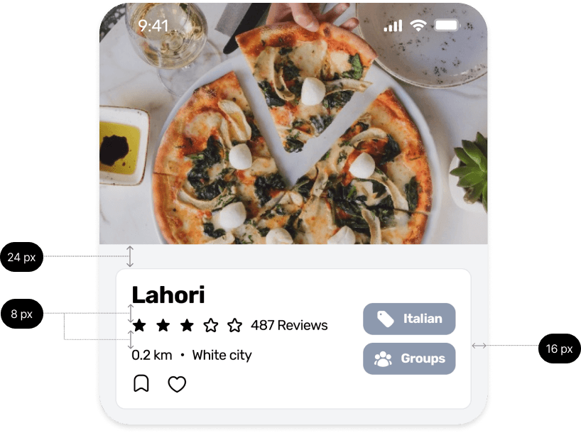
I’ve used an 8-point grid system for this project. When it comes to the overall margin I set it to 16 and margins between groups vary between 8, 16, 24 and 32 px. All designs were also created using auto-layout.

High fidelity prototype and user testing


During the testing process, users were given tasks to evaluate the ease with which they can perform them. Additionally, user testing serves as a means to assess quality control in terms of navigation. Depending on the feedback received, it can also help identify and address any errors or confusion experienced by the users.
Initial testing results
During the first user testing, it was observed that 70% of participants encountered difficulties in navigating the menus. This issue was attributed to the absence of labels in the footer. Despite this challenge, all users successfully managed to book a restaurant, access information about nearby restaurants, and view their bookings.
Updated testing results
During the second round of user testing, all participants navigated the app without encountering any issues. Notably, I observed that users demonstrated increased speed and confidence in their navigation.

Project conclusion
As my first case study, I can say it has been a challenging yet insightful journey. Throughout, I learned about the market, conducted a survey, created MI-FI wireframes, transformed them into HI-FI UI designs, prototyped them, and successfully conducted a mini usability test. What a journey it has been, and I'm just getting started. There are still many things to learn and improve, making it an even more exciting adventure ahead.


Copyright
© 2024 Daniel Alves. All rights reserved.
Follow my work
Contact
Email me at danielalexandreromano@gmail.com


